ACEA Global website revamp
UX DESIGN INTERN
Summer 2020
ACEA is a fast-growing startup and the leading platform for continuing education (CE) management. ACEA streamlines the experience for busy professionals to comply with their CE requirements. Their flagship product, The CE App, helps professionals manage all of their CE and ensure compliance.
streamlining user experience
Clients coming to ACEA are looking for ways to manage their license compliance. Whether they are individual practitioners, hospitals, or an association, they hope to find a way to manage their required Continuing Education (CE). These different targeted audience needs to be guide accordingly to what they are looking for.
defining current problem
When navigating the current website, users often find themselves lost and confused as they often skip through chunks of text. The challenge was to make it easier for potential clients to find information and contact us for our service. By investigating the current website layout and understanding where users feel confused, I hope to guide them according to different types of CE tracking that they are looking for.
Based on the website visitor analysis on Google Analytics, I created different user personas to visualize ACEA's main visitors and how we can streamline their experience.
addressing pain points
Now, imagine making these 3 different users go through the same navigation, even though they are looking for different things! How do we customize this flow so that we can direct them to their desired resource?
Key Takeaways: The current website has a lot of text and a lack of clear call-to-action (CTA), which takes user longer to read all of the information instead of guiding them to the right information right away, leading to high drop-off rates and frustration.

a nurse looking to keep track of her CE


a representative managing employee's credentials
educators looking for a network of professionals
UX flows
This new flow will allow 3 targeted stakeholders to have multiple access points to the desired information (highlighted in gold). The homepage will segment users and guide them appropriately.

Desired user flow for the new website

New architecture flow for the site, including more touchpoints
low fidelity prototypes
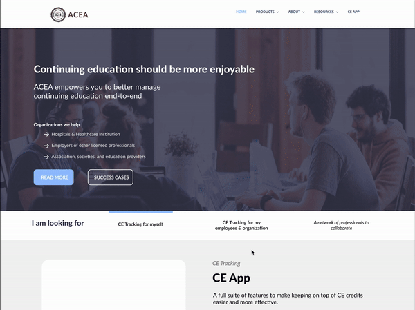
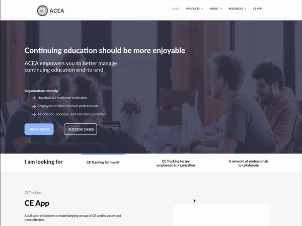
After creating the information architecture, I started to build the foundation for the site, starting with the homepage. Here are iterations of how I segmented users from the first touchpoint
Direction A: Stakeholders can find their desired information as they scroll down the page to find their desired content in each container, making it accessible from the first touchpoint

Direction B: Intro container above the fold with anchors that automatically scrolls users to appropriate containers. However, after testing, we found that users find it hard to have to scroll all the way up if they click on something by mistake. We also wanted to save space above the fold for more information on ACEA as well.
Direction C: After changing up the design to a more compact and modern navigation bar that highlights where you are on the page, making everything more on-brand and cohesive. However, users were still experiencing friction as they have to scroll up if they accidently clicked on something.
Direction D: Using a compact, responsive in-page navigation with anchors automatically scroll users to appropriate containers. As users scroll to a certain box, the in-page menu slide to the according area.